09 Feb 2021
Stations: Instagram Takeover with Marcus Prasad
Over the course of Stations: Some Recent Acquisitions, Academic Programs Assistant Marcus Prasad will take over the Belkin’s Instagram to talk about works in the exhibition. Fostering a casual and open dialogue, these posts will consist of an array of personal anecdotes, conversations with staff and curators, and connect to other public artworks in the city. Shorter excerpts will be posted on the Belkin’s Instagram, while the full versions of each post will be collected here.
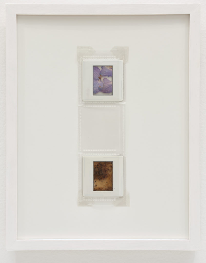
Laiwan, she who scanned the flowers of the world, print #GR340 and #SB379 (2017)
When entering the first gallery of the Stations exhibition, it’s sometimes difficult to ground yourself amidst the array of works in the space. Sculptures create a maze along the floor, paintings and photographs are scattered amongst the walls, videos strobe, and the fluctuating sound of drums weaves in and out unexpectedly. Almost three months into this show now, I still have a hard time focusing on one work at a time in this room. I’ve been more so attuned to the network of connections the works make together, that honing into the individuality of each piece didn’t seem to matter as much. However, after a lovely conversation in this space with Public Programs Assistant, Bahar Mohazabnia, I was reminded of the intimate moment of reflection each work in this room can offer us; a space of privacy nestled within the frantic movements of its surroundings.
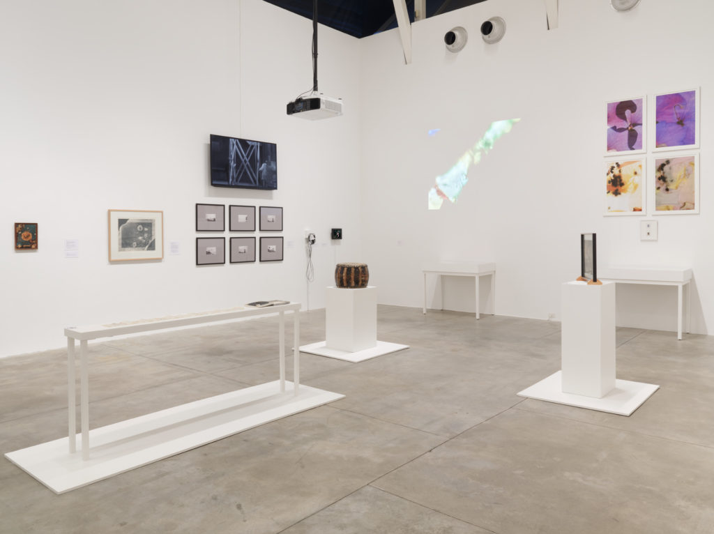
Bahar and I navigated the maze of plinths and tables toward the east wall of the first gallery, where Laiwan’s she who scanned the flowers of the world, print #GR340 and #SB379 from 2017 hangs prominently. I am immediately struck by its closeness to Sam Perry’s Into It, whose psychedelic visuals almost mimic Laiwan’s own use of colour through flower petals. The interplay that emerges between Perry’s intense strobing lights and Laiwan’s saturated, yet delicate hues make me think of the visual parallels shared amongst the electronic and natural world. she who scanned the flowers of the world also neighbours the gallery’s salon-style painting wall, placing it in relation to a series of works that adopt an abstract expressionist sensibility. The work therefore positions itself amongst this school of thought, which allows me to conclude that Laiwan is working within a mindset of abstraction. What really draws me in however, is how evidently non-abstract the work is when you look closely.
Placed directly in between abstract works of film and painting, Laiwan’s piece is surprisingly not. We are seeing,
quite clearly and didactically,  a magnified perspective of yellow and purple flower petals. The slide containing these petals is seen under the four enlarged prints to further cement this empirical vision, as if presenting some kind of scientific evidence. In this way, we are certain of what we see – and what we see is a moment of forced closeness, a space that asks us to zoom into its materiality when we’re used to being zoomed out ideologically in the realm of the abstract.
Bahar tells me that there is a violence inherent to this magnified form of beauty – these flowers are plucked from their stems and flattened inside a frame, providing an awareness of the work’s process. Similarly violent, this tight closeness to flower petals is thrust upon us, pulling us directly into a space of deep reflection whether we are willing to enter it or not. As such, Laiwan brings forth this new space that lives within the wider gallery context, a space of natural shapes and forms that momentarily detaches us from the bustle of the crowded room. Bahar notes that this kind of space-creation is characteristic of Laiwan’s other work as well. Forging connections to the local, she makes viewers aware of the specificity of place. While this may not be entirely obvious in she who scanned the flowers of the world, there are gestures toward site specificity, like to the place from which these flowers are native. Perhaps in a more abstract sense though, I think this work demonstrates site-specificity by the kind of space it creates – a realm of ephemerality within one that is physical, a momentary lapse in the familiar temporality of gallery-viewing that draws us into close looking, slow analysis and deep reflection upon oneself and the object before us.
As Stations comes to a close this week, I’m thinking about how each of the works in this exhibition, like Laiwan’s, creates their own spaces, their own temporalities and their own worlds. At the same time however, a matrix is created through their interconnections and relationships. I’ve looked closely and slowly at many of the pieces here over the past three months, but I’ve also made sure to pay attention to how they speak to one another and build off of each other. This oscillation between zooming in and zooming out sometimes results in motion sickness, but it has revealed to me the infinite layers of dynamic analysis and interpretation a single work of art can produce when it is allowed to work with others.
I started this takeover series with an anecdote about how I didn’t know much about the Belkin or its collection. I still don’t feel like I know it in its entirety, but I also don’t feel like that’s possible. What does it mean to “know” a collection? I don’t have this answer. But I did gain valuable insights into how a collection comes to be known; how a well thought out and well-intentioned curatorial strategy creates the framework for a canon to emerge. I’m left with a perplexing reflection on how knowledge can be created through art, a similar conclusion I seem to reach after every exhibition at the Belkin throughout my past seven years at UBC. While a single work of art can tell us something in one voice, exploring a work’s relationship to other works, the space it creates, its surrounding space, the viewer and their subjectivities creates a multifaceted realm of analysis that yields productive findings in all directions.
And with that I conclude my meandering series of thoughts on my favourite works in Stations. Thank you for following along, and stay tuned for our next exhibition, Fata Morgana, opening on April 30, 2021.
Photos (from top): Belkin exterior shot with witch hazel by Michael Turner;
installation view of Stations by Rachel Topham Photography, Laiwan, She who scanned the flowers of the world, print #GR340 and #SB379, 2017, photos by Rachel Topham Photography
Kati Campbell, Production (1987)
I feel the need to start this entry with something of a disclaimer, since this next work feels so related to my recent experience that I may get a bit carried away. Kati Campbell’s Production from 1987 drew instant connections to my recently completed master’s thesis Splitting Space: Destabilizing the Suburban House in Postwar Art and Contemporary Horror Film – representations of things associated with the home, with a hint of something strange.
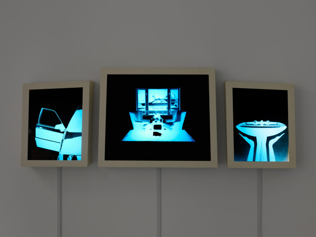
Production is three lightboxes hung up on the north wall of the Print Gallery, reminiscent of Jeff Wall’s monumental illuminated photography, but framed like an altarpiece from the northern renaissance. Its contents appear abstract at first, like a jumble of indiscernible geometric blue shapes or objects. Upon closer inspection however, a living room scene is revealed in the center. Two chairs facing one another are positioned on a rectangular rug in front of a window, creating an overall symmetrical composition. The flanking lightboxes are a bit less contextual but maintain this sense of symmetry – the left offering a closeup of a car with its door open, and the right presenting a bathroom sink. The combination of these spaces and objects allow the viewer to conjure up thoughts about home, intertwined with feelings of comfort and safety that are associated with it.
In my conversation with Michael Turner about this piece, he suggested that in addition to these associations with home, Campbell is subtly drawing attention to the inherent femininity linked to notions of domesticity. The perfectly organized and clean interior harkens to the idea of a suburban housewife, the composition of the bathroom sink is surprisingly uterine in shape, and the car door opens on the passenger side, where the wife would normally enter the vehicle. As such, representing this kind of social space with disruptive techniques directly challenges these engrained gendered roles inherent to the creation of the home.
So what makes this space so strange and disruptive? To me, the home represented in Production is immediately understood as uncomfortable or uncanny because of its inverted colours, providing a deep sense of darkness. The stark blue and black turn the home into a kind of specimen, an object of clinical observation like an x-ray at a doctor’s office. The car, the living room and the bathroom sink, in all of their sterile symmetry, hover in a black void as if we’re encountering them in some kind of alternate dimension rather than from the familiarity of our own house.
Hence the connections to my thesis. Throughout my research, I focused on American postwar art that tackled the concept of the home through the emergence and growth of the suburbs, and compared them to more recent representations of the suburban home in my favourite horror films. Some of my questions included how suburbia helped create a collective understanding of American social normativity after World War II that was predicated upon the nuclear family, and the artists and filmmakers that began to challenge this idea through disruptive representations of the home. By disruptive, I mean representations that transform this space into something uncomfortable, weird and scary, instead of promoting its postwar image as a transparent space of warmth and insularity.
Perhaps I am drawn to Production because it adheres to a similar methodology? The home is flipped and turned into a negative image here, literally. Though my thesis focused on the American context, I find it interesting how similar concerns pervaded the Canadian sphere as well. The idea of the suburbs and the nuclear home has resonated throughout the Western cultural climate broadly, and has encouraged many artists to reflect upon and challenge its foundation.
Who belongs to this space? Who gets to enter it, and enjoy its comforts? How has the idea of the home infiltrated our own understanding of normativity? By flipping the script, Production confronts us with the kinds of questions we often elide, given that our sense of home is so deeply engrained in our everyday experience, consciously or otherwise.
For further investigation, I can shamelessly promote Splitting Space: Destabilizing the Suburban House in Postwar Art and Contemporary Horror Film (see: UBC Library Open Collections), but I would also highly recommend (re)considering suburbanization in Vancouver via Ken Lum’s Vancouver Especially (2015). This work is a play on the ubiquitous “Vancouver Special” architectural style of homes that was popularized from the 60s to 80s. Lum stuck to a production budget of $45,000 for this work, which is equivalent to what a Vancouver Special would have cost in 1973. The result in 2015 was a house shrunk to a third of its original size, completely uninhabitable. Though Lum’s piece is no longer on display, Vancouver Specials exist throughout the suburban neighbourhoods of the city. I encourage you to go for a walk through Mount Pleasant, Hastings Sunrise, and/or Strathcona to think through the prototypical house design and its attempt to standardize the home experience for Vancouverites.
Photos (from top): Belkin exterior shot with witch hazel by Michael Turner; Kati Campbell, Production, 1987, photo by Rachel Topham Photography
Ilse Garnier, Ermenonville: Partition pour un promeneur solitaire (1984)
More specifically though, it reminded me of the times I’ve visited France and walked the streets, listening to the conversations of passersby, and picking up fragments of sentences that I could translate in my head. Then I inevitably remember my dream to masquerade as a native francophone, which broke down piece by piece each time I ordered a café au lait in French and received an English response. Was my accent that bad? Oh well.
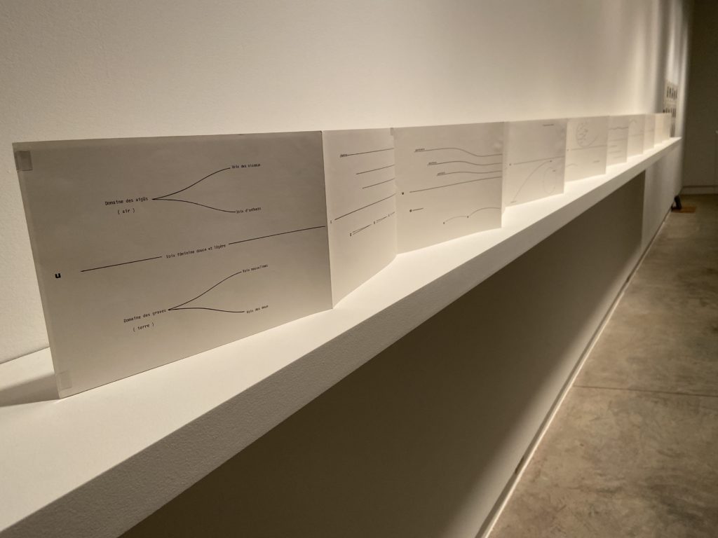
Aside from this piece’s valiant dissolution of my bilingual alter-ego, Ermenonville ultimately hones in on those few words that we might be familiar with, and supplements them with gestural notations that act almost as illustrations of each term. The word “lac” repeats several times, and is assembled into the shape of ripples that appear to move along the surface of a body of water. This visual accompaniment helps me understand that the French word refers to a lake, even if I don’t know French.
As such, our full engagement with the piece is not solely reliant on retaining what was memorized for a French vocabulary test long ago. Instead, it introduces the notion that a collaboration between text and other visual forms can enhance and crystallize our comprehension of something that seems foreign. Like Dorothy Iannone’s An Icelandic Saga from my last post, text becomes image and image becomes text, but of a different sort. We are not seeing a didactic representation of a walk through a park here – there’s no colour, figuration, or single-point perspective creating a convincing or illusionistic space. Instead, Garnier offers a visual toolkit, consisting of basic markings and symbols, which helps us construct our own embodied experience of a walk in a park, one informed by our own subjectivities, memories and visualizations.
What do you see, hear and feel on a walk in a park? Maybe you encounter a cygne gliding in circles on the lac? Maybe the vent starts strong then tapers off as you continue forward? Maybe the chant du rossignol interrupts the progression du silence? In any case, what’s illustrated here is a multi-sensory experience boiled down to its most basic system of signification – line and text dissolving in and out of the recognizable shapes, movements and gestures often seen on a walk.
Though it creates the experiential conditions of the outdoors, Ermenonville allows us to reflect upon these sensory engagements in a gallery context. Walking alongside the outstretched leporello in the Print Gallery mirrors a park promenade, and reveals many of the bodily similarities shared between a reflexive outdoor experience and how we might conduct ourselves in a gallery space. Meandering slowly, gazing up, down, and around, and giving increased attention to what we see, hear and feel, are mutual proponents that bind these two spaces together intrinsically.
The particular experience of this work draws connections to Gwen Boyle’s outdoor artwork Footnotes (1994), installed at the 1300 block of Pacific Boulevard in Vancouver’s Yaletown neighbourhood. Consisting of 57 unpolished black granite tiles recessed into the sidewalk, each engraved with textual excerpts that specifically reference the site, Footnotes seeks to link language from various sources to the experience of an outdoor Vancouver environment. Boyle quotes from the City Archives, the C.P. Railway Archives, anthropologists and poets for this project, synthesizing differing uses of language with our personal sensations of the outdoors. I encourage you to visit, to partake in an embodied, sensory moment of reflection, and to pay attention to how these words impact your personal experience of public space.
Photos (from top): Belkin exterior shot with witch hazel by Michael Turner; Ilse Garnier, Ermenonville: Partition pour un promeneur solitaire, 1984, photo by Teresa Sudeyko; installation view of Stations by Rachel Topham Photography.
Dorothy Iannone, An Icelandic Saga (1970)
I’ve always had a strange relationship with romance stories. I think my immediate aversion to them comes from a fear of getting so wrapped up in the narrative that I lose myself entirely – perhaps a result of relating to characters so intensely that it hurts. I guess deep down, I am a hopeless romantic, despite what I try to tell myself. The intensity of the ups and downs draw me in so fiercely that I feel like the characters are part of my real life, or are me. Flashback to the week-long inconsolable mess I was after reading Call Me By Your Name.
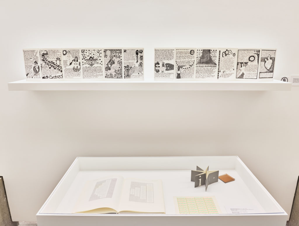
I’ve always had a strange relationship with romance stories. I think my immediate aversion to them comes from a fear of getting so wrapped up in the narrative that I lose myself entirely – perhaps a result of relating to characters so intensely that it hurts. I guess deep down, I am a hopeless romantic, despite what I try to tell myself. The intensity of the ups and downs draw me in so fiercely that I feel like the characters are part of my real life, or are me. Flashback to the week-long inconsolable mess I was after reading Call Me By Your Name.I am reminded of this personal connection to romantic stories when I spend time with Dorothy Iannone’s An Icelandic Saga (1970), a work featured in Stations. It’s impossible to miss – eight leporellos strewn out across four vitrines, taking up almost the entirety of the Belkin’s foyer. During my weekly ambulation through the exhibition, which typically begins in the first main gallery, weaves into the second, then wraps around into the hallway toward the front desk, I stopped to really sit with this piece. What I had thought was its beginning was actually the final page of the leaflet series that read “THE END.” What?
My usual choreography throughout the exhibition space was interrupted by Iannone’s collection of folded leaflets and the order in which they are installed. Instead of following my regular pathway from the end of the hallway to the main entrance, the placement of An Icelandic Saga invited me to jump forward to its beginning, then cycle back. While this disturbed an intuitive sense of movement, it did make sense; I’m used to reading books from left to right.
I skip ahead to position myself in front of the first page of the work, and am introduced to several characters with whom I would soon form a deep connection: Dorothy, James, and Dieter, and the story of love, divorce, and self-discovery that would ensue. An Icelandic Saga recounts the true events of married couple Dorothy (the artist) and James, who embark on a boat trip to Iceland. Unexpectedly, Dorothy falls in love with Dieter, one of the few passengers on the boat, and decides to divorce James immediately upon their return to New York to live with Dieter in Iceland.
As I begin reading the piece, I’m immediately hooked in by the drama. I then become acutely aware of how I’m being asked to read this piece. Sections of text are bold, in large type, almost like Microsoft WordArt, while others are tiny, in cursive, and sometimes indiscernible. I notice which parts I can speed through, and the areas where I have to squint really hard – maybe a reminder to start wearing my glasses more often.
The process of reading this piece becomes increasingly more challenging, and I find myself needing to take breaks. Lines of text cascade diagonally and sideways. Narrative progression is interrupted by pages of synopses and lists. Image becomes text, and text becomes image. This confusion is exacerbated by Iannone’s passage on the fifth page which reads, “forgive me if I tell this story in the third (or fourth?) person but it’s the only way I can do it today.” As such, I am made aware of the surface of the story in a way, the things that hold a cohesive story together, and how they’re kind of lacking from this work. There is no easy or linear flow here. Instead, there are pauses, interruptions, missteps, and ambiguations, all of which bring attention to the building blocks of what a story is, and how it’s conveyed by markings on a surface.
In my conversation with writer and curator Michael Turner, he told me about the importance of visual storytelling in Iannone’s work and its relation to the aims of Concrete Poetry. He notes that although this piece is from 1970, Iannone had been working in this style in the late 50s and early 60s, making it contemporaneous with a lot of artists in the Concrete Poetry movement. An Icelandic Saga is therefore not only an exercise in personal storytelling and illustration, but an investigation into the potential of language as an expressive form, teeming with transformational possibilities that extend past its seemingly sole purpose of moving a narrative forward. Michael also tells me that this speaks to Scott Watson’s curatorial decision to place the leaflets above vitrines featuring works of Concrete Poetry. Iannone’s foldouts and their proximity to the Concrete works of Ann Noël, Neide Dias de Sá, and Lily Greenham allow us to parse out the formal experimentations An Icelandic Saga mobilizes with language.
In this way, there appears to be a kind of oscillation between being thrust deep into the narrative complexity of Dorothy, James, and Dieter’s journey, while simultaneously being pulled out of this space by an awareness of the work’s textuality. As I mentioned before, the clearly legible parts of the piece allowed me to read quickly, eagerly awaiting Dorothy’s next step as she develops her love for Dieter. The more unclear parts however invited a more challenging form of engagement, where I am asked to put in a bit more effort to glean narrative bits.
This leads me to think about the notion of temporality, and how this work takes us in and out of different conceptions of time. At different moments we read the work swiftly, while at others we are asked to have more patience. This is mirrored by the spatial interruption that the placement of the work in the gallery causes. Rather than following a transcribed path through the exhibition, down the hallway toward the front desk, we are asked to pause and to backtrack, disrupting our normative sense of time and flow through the gallery space.
The romantic nature of Iannone’s story also speaks to a kind of temporal rift, and echoes the work of one of my favourite queer theorists, Elizabeth Freeman. She argues in Time Binds: Queer Temporalities, Queer Histories (2010) that love and romantic attachments are sensations that move according to their own beat, and are reconceptualized as experiences that are outside of ordinary time. The way Iannone’s storytelling throws us in and out of its own sense of time, bringing us into the space of tumultuous romance, while simultaneously showing us the pieces that make that space legible, directly speaks to why it felt like I was reading this work for hours. I was jumping through different dimensions of emotion and textual analysis, each of which possess its own dynamics of time.
Experiencing the blossoming love story between Dorothy and Dieter, and learning about her own self-discovery as a result, formed inevitable connections to other endearing love stories I’ve encountered. For example, those between my parents, my grandparents, my friends and their partners, or even the famously unrequited connection between Elio and Oliver. It also drew ostensible connections to my own experience in love – a personal layer that could be seen as yet another temporal dimension added onto the experience of this work, if you will. I’m reminded of my own moments of romantic celebration and upheaval, of individual growth, and of times when all of these things combined together to create what felt like a lifetime’s worth of emotional exploration.
An Icelandic Saga’s powerful storytelling caught me at an unexpected moment, and took me out of the rhythm of my work routine. This pause was filled with thoughtful reflection and reminiscing, a welcome break from the ordinariness of the everyday.
The specific form of engagement Iannone’s work asks of its viewers reminded me of the public exhibition space at the Waterfront Canada Line Station. Often featuring works in series, this space is always curated with an eye toward its viewership, which primarily consists of commuters rushing through to reach their destinations. In this way, the exhibition space is liminal and contingent on a sense of constant flow and movement. I recommend visiting Charlene Vickers’ In the Garden (2019), an acrylic painting series about land transformation currently installed in the Waterfront Station hallways. When walking through the space, pay attention to how you’re asked to engage with her work. Are you given enough space and time to study the work as if you were in a gallery? Where is the beginning of the piece? Where is the end? How is its narrative contingent on your body moving through space?
Photos (from top): Belkin exterior shot with witch hazel by Michael Turner; installation view of Stations by Rachel Topham Photography; Dorothy Iannone, An Icelandic Saga, 1970, photo by Rachel Topham Photography.
Joan Balzar, Exit (1967/2003)
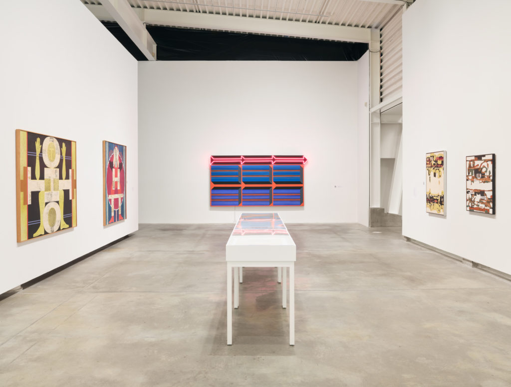 I love seeing this work take up such a prominent space in the gallery, not only for its use of bright and captivating colours, but for the specific memory it brings up for me. It reminds me of the first time I applied for a job at the Belkin (as a gallery attendant in 2016). I had just started my last year of undergrad in art history, and with no gallery-related experience, I felt I had enough enthusiasm to be a good fit. I had no sense of what a gallery interview might look like, though. I was really nervous and I wanted to make sure I had all my bases covered.
 I love seeing this work take up such a prominent space in the gallery, not only for its use of bright and captivating colours, but for the specific memory it brings up for me. It reminds me of the first time I applied for a job at the Belkin (as a gallery attendant in 2016). I had just started my last year of undergrad in art history, and with no gallery-related experience, I felt I had enough enthusiasm to be a good fit. I had no sense of what a gallery interview might look like, though. I was really nervous and I wanted to make sure I had all my bases covered.What if they ask me what my favourite Belkin exhibition was? Or my favourite work in the collection? I truly didn’t know that much about the Belkin, but I wanted to look like a qualified and deserving candidate. I browsed through past exhibitions on the website, hoping to see a familiar artwork – maybe an Emily Carr or something.
Then I encountered Exit from the Becoming Animal/Becoming Landscape and Joan Balzar exhibition, a show partially dedicated to the artist’s work as a key figure in 1960s West Coast abstract painting. I won’t say that looking at it online changed my understanding of life in some seismic way, I honestly just liked the loud colours and its use of neon.
Still, I tried to concoct a philosophically enlightening reading of Exit for my interview – something along the lines of how the marriage between neon and painted canvas speaks to the human condition. I wanted to impress not only the Belkin staff, but to prove to myself that I was good at this whole art history thing. To the dismay of my 20-year-old self, I wasn’t asked about my favourite Belkin piece during my interview. I also didn’t end up landing the job.
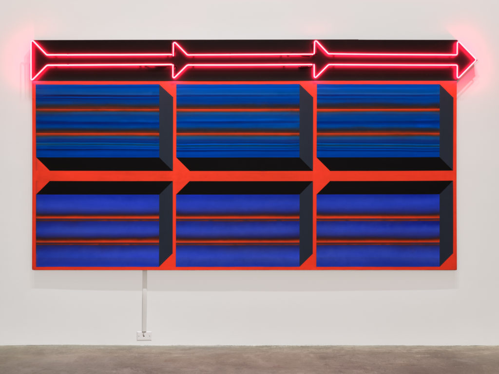
Fast forward to 2021. I’m now in my third position at the Belkin, and Balzar’s piece has its own wall in the Stations exhibition. Right away, it’s a glaring reminder that I didn’t get the job I wanted, when I wanted it. Upon further reflection though, it encourages me to remember that things worked out in a different way, they just required a bit more time and patience on my end. Exit is a pleasant reminder of my own history with the Belkin, a funny time in my life when I thought things would always go my way. It’s also a reminder of how deeply personal each person’s engagement with a work of art can be, no matter what it depicts, represents, or makes us think about.
To see more neon works in the city, I encourage you to walk down Granville Street in the downtown core, or meander through the neighbourhood of Chinatown. These spaces hearken to 1950s-70s Vancouver in which an abundance of neon signs (more than 19,000 total) proliferated all over the city. Many have since been removed, but Vancouver artists such as Ken Lum have addressed this bright history in their work. Lum’s Monument for East Vancouver (2010) can be found at the intersection of East 6th and Clark Drive.
Photos (from top): Belkin exterior shot with witch hazel by Michael Turner; installation view of Stations by Rachel Topham Photography; Joan Balzar, Exit, 1967/2003, photo by Rachel Topham Photography.
Related
-
Exhibition
8 Jan – 11 Apr 2021
Stations: Some Recent Acquisitions
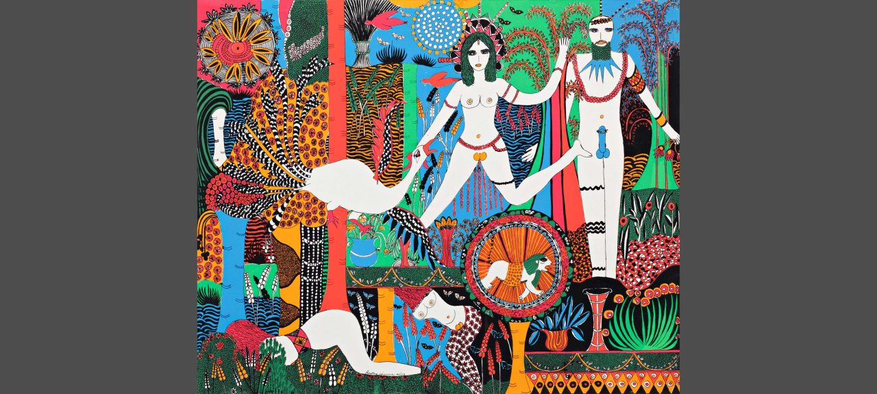
Due to the uncertainty caused by the COVID-19 pandemic, we are postponing the Image Bank exhibition until June 2021. Our January exhibition will draw on recent acquisitions to the permanent collection. Titled Stations: Some Recent Acquisitions, the exhibition will be in four or five interrelated modules that explore some of the gallery’s research areas.
[more] -
Event
12 Jan 2021
Curator Tour: Stations with Scott Watson
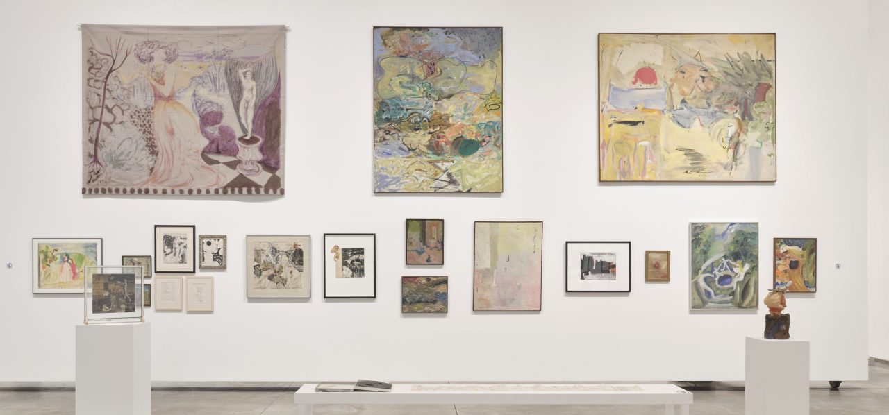
Stations: Some Recent Acquisitions explores some of the Belkin’s research areas through a selection of new works in the permanent collection. Director and curator Scott Watson walks through the exhibition and offers insight into some of the key works and themes.
[more]